Reporting
Basic Charts
EXM has support for nine out of platform reports (OOP). These nine reports are at once available to users to view and interact with their data. The reports are remarkably like MS-Excel with respect to the look and feel.
These reports are designed to address the immediacy of a particular aspect of data that is not overly complex but requires some action to address.
While these are the OOP reports, there are capabilities to change these reports using trained resources that can tailor a report to meet any business requirement.
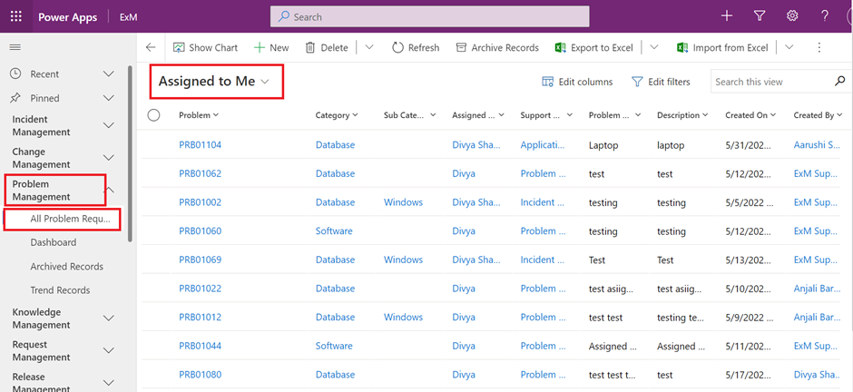
Open a model-driven app that contains your table via a solution or open the app directly from the Apps area.
Select next to the app, and then select Play. The model-driven app opens in a separate browser tab.
On the left navigation pane, select a table such as Accounts.
On the command bar, select Show Chart.
The chart pane opens.
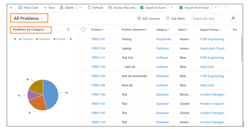
By selecting the dropdown chart list, any of the system charts in the app will be available to select.
The chart appears in-line with the data view.
Power BI Charts
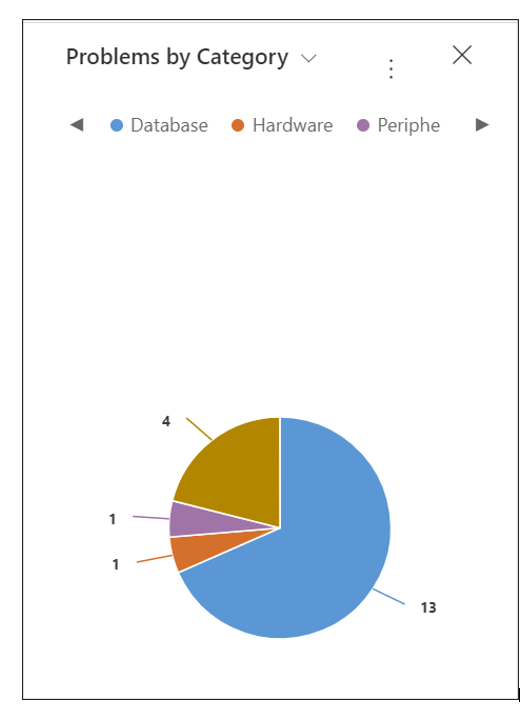
Select a bar on the chart to filter the data in the view.
Refresh the chart to display other data by changing the view.
Add the chart to a model-driven app dashboard.
When data requirements are beyond “Easy” the platform leverages the full capabilities of “Power BI” (PBI). A major benefit to most organizations is that they already have licensing in place to gain access to PBI at no added cost. Just this single aspect of the system will certainly bring a smile to all executive and financial managers to no longer worry about expensive add-ons to get access to view insightful and strategic aspects of their data to make informed decisions.
Any aspect of PBI can interact with EXM to extract detailed trending, predictive data metrics and other advanced reporting. To take full advantage of these features all a team needs is access to PBI and an understanding of the EXM data model.
Regardless of how data is created and organized, EXM presents a very intuitive manner for presenting these collections of data into a user consumable format that is organized by technical or business needs.
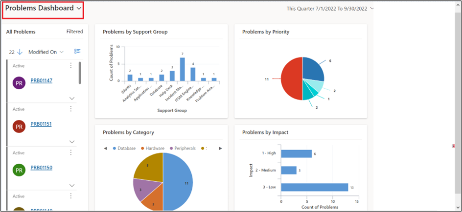
Dashboard
A dashboard is a collection of reports whether labelled as “Easy” or “Advance” into a logical grouping that supplies business or technical information to specific users.
After any report type is created it may now be associated to the webpage for viewing. As best practice a strategic and insightful dashboard has between 4 to 6 reports. These reports supply a very targeted view into the data being collected and seen. Thus, aiding a company to make informed decisions whether from a business or technical perspective to keep guidance on a company’s ITIL journey.