Basic Charts
EXM has support for nine out of platform reports (OOP). These nine reports are at once available to users to view and interact with their data. The reports are remarkably like MS-Excel with respect to the look and feel.
These reports are designed to address the immediacy of a particular aspect of data that is not overly complex but requires some action to address.
While these are the OOP reports, there are capabilities to change these reports using trained resources that can tailor a report to meet any business requirement.
View The Charts
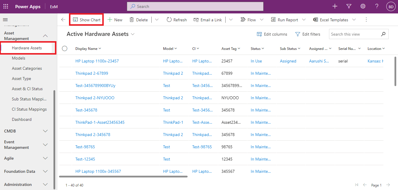
Now that the chart has been created, it can be used to visualize table data in the model-driven app. Follow these steps to view the chart:
- Open a model-driven app that contains your table via a solution or open the app directly from the Apps area.
- Select next to the app, and then select Play. The model-driven app opens in a separate browser tab.
- On the left navigation pane, select a table such as Accounts.
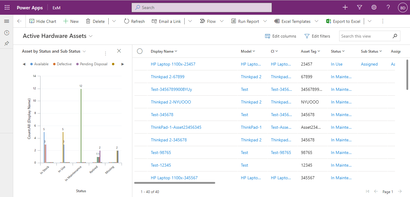
- On the command bar, select Show Chart.
The chart pane opens.
- By selecting the dropdown chart list, any of the system charts in the app will be available to select.
The chart appears in-line with the data view.
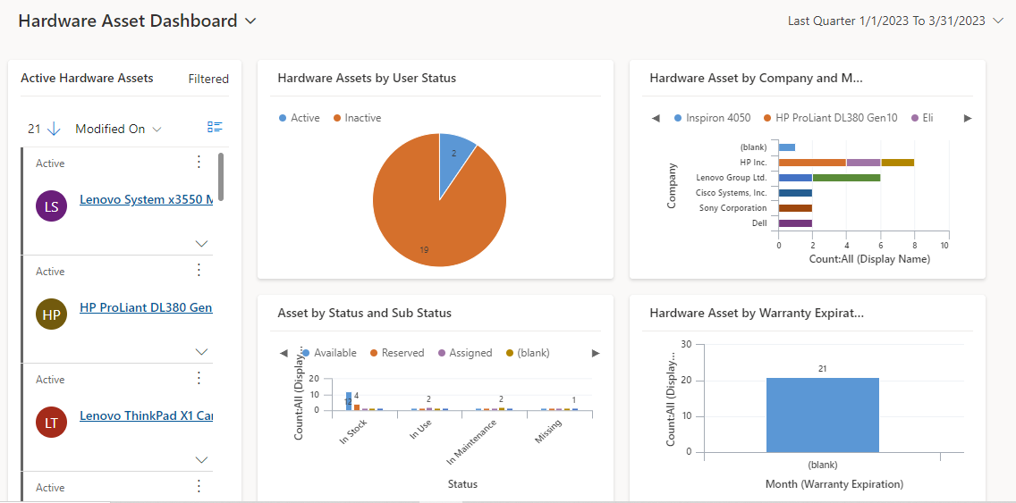
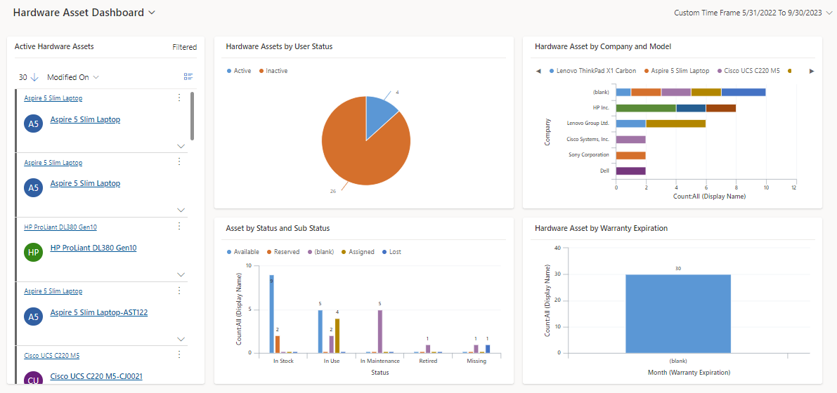
Dashboards
A dashboard is a collection of reports whether labelled as “Easy” or “Advance” into a logical grouping that supplies business or technical information to specific users.
After any report type is created it may now be associated to the webpage for viewing. As best practice a strategic and insightful dashboard has between 4 to 6 reports. These reports supply a very targeted view into the data being collected and seen. Thus, aiding a company to make informed decisions whether from a business or technical perspective to keep guidance on a company’s ITIL journey.